Assess the climb
Make difficulty, distance, and essential route details visible early.
 ← Selected work
UX case study · retrospective
Designing clearer route discovery and navigation for climbers—especially when dependable cell service cannot be assumed.
01 · The challenge
Climbers need to judge whether a route matches their ability, understand current safety conditions, and find the route itself. Existing information could be fragmented across maps, comments, and external tools—an especially poor fit for remote areas.
The concept centered on one question: How might a single mobile experience help climbers confidently choose, prepare for, and navigate to a climb?
Design goals
Make difficulty, distance, and essential route details visible early.
Surface practical advice and recent experiences from other climbers.
Keep route guidance inside the experience and account for low-service conditions.
02 · Starting the design
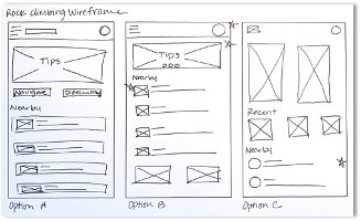
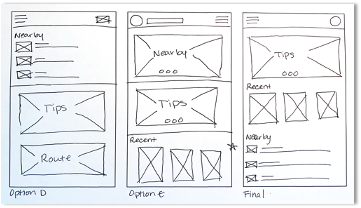
I began on paper, comparing homepage structures and prioritizing three repeatable actions: discover nearby climbs, review route information, and start navigation.
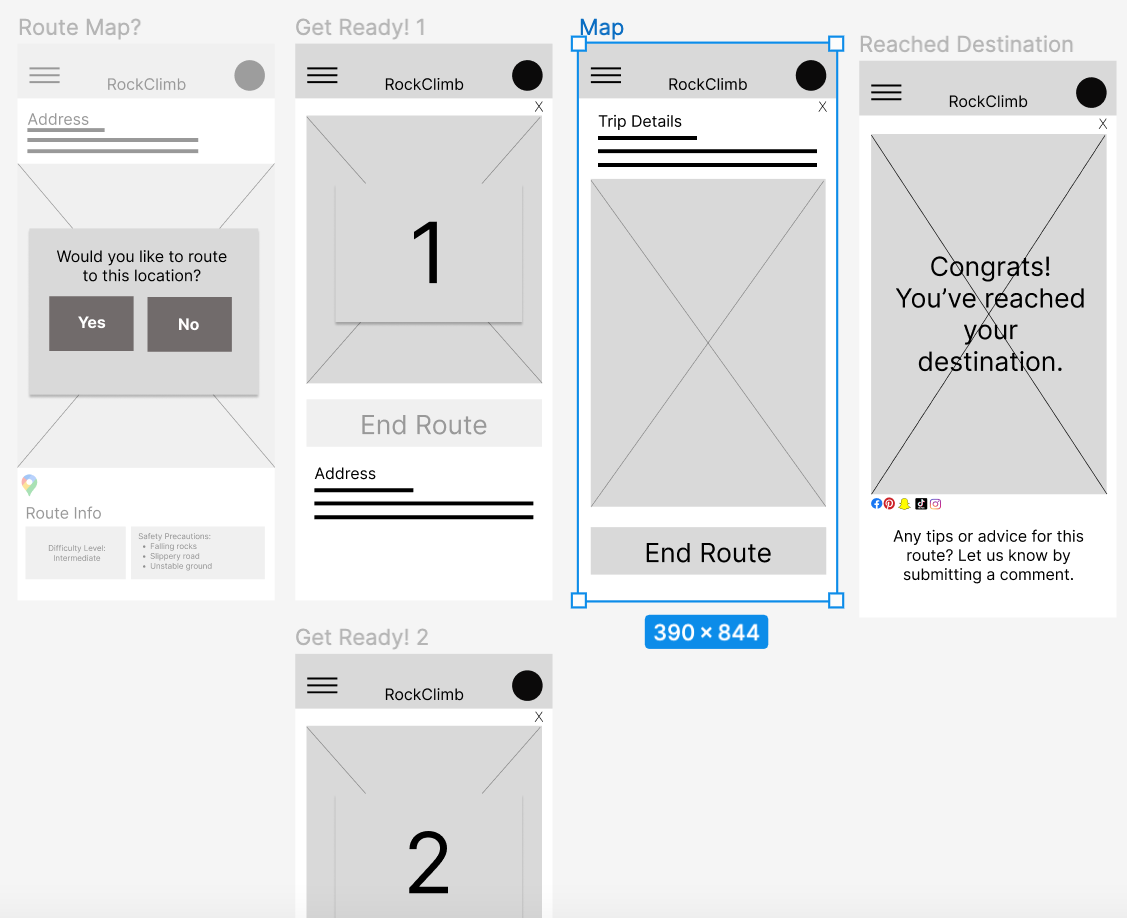
Digital wireframes
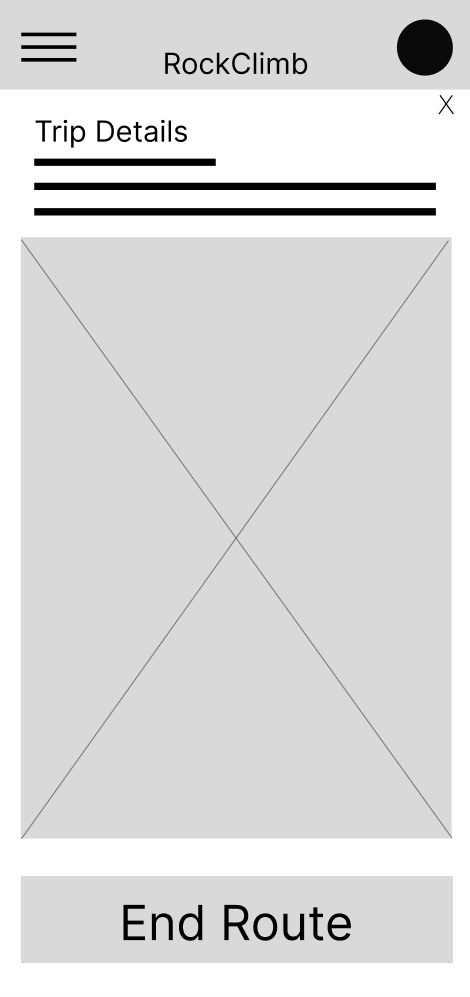
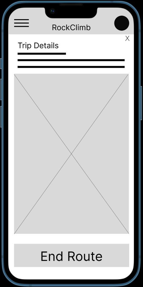
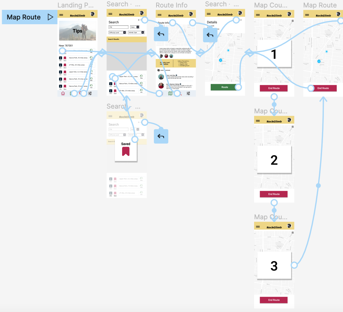
The low-fidelity flow connected route discovery, details, community guidance, and turn-by-turn navigation. Keeping the map inside the app reduced context switching and made the path from decision to action easier to follow.
At this stage, the interface intentionally stayed plain so testing could focus on structure and expectations rather than visual polish.
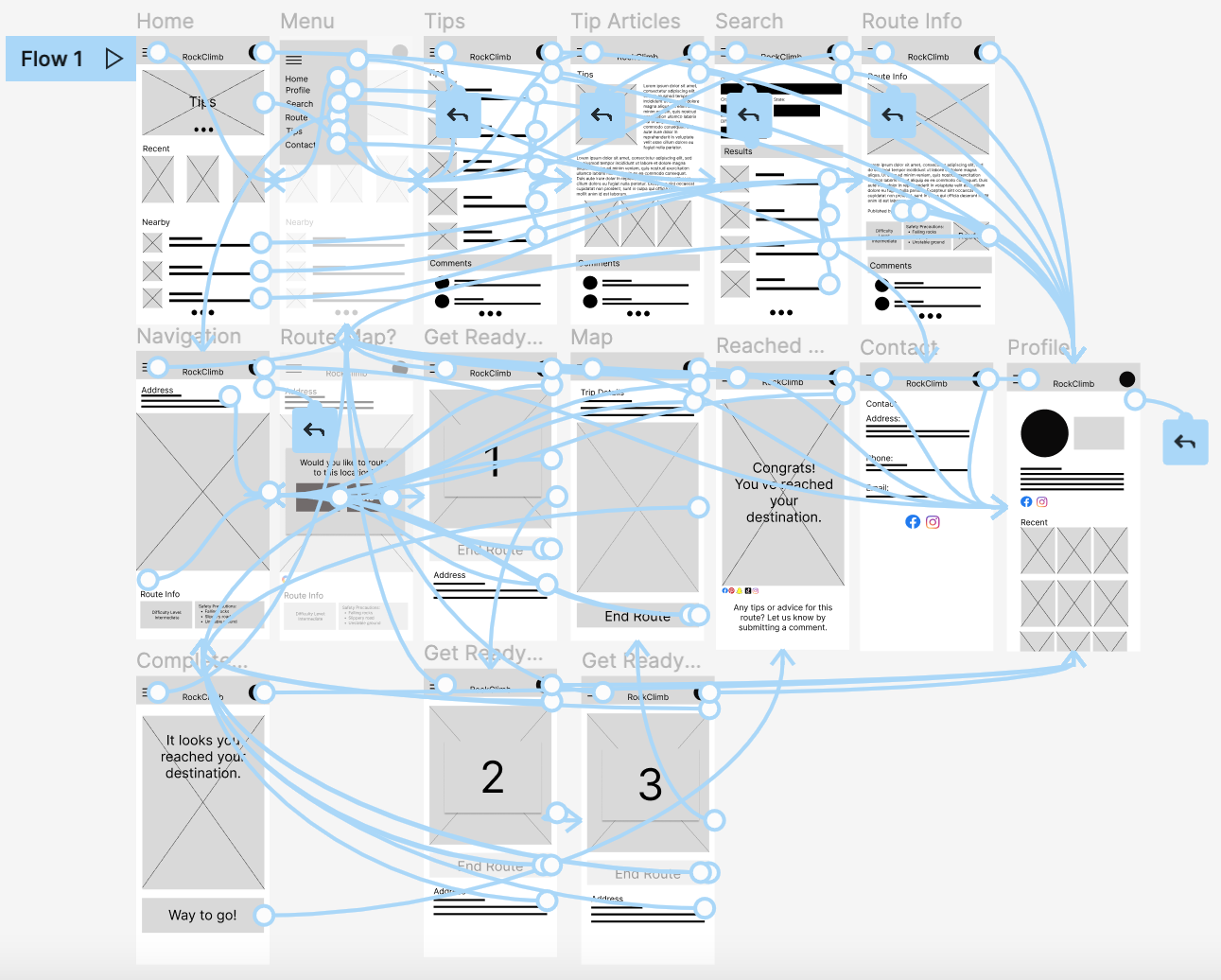
Low-fidelity prototype
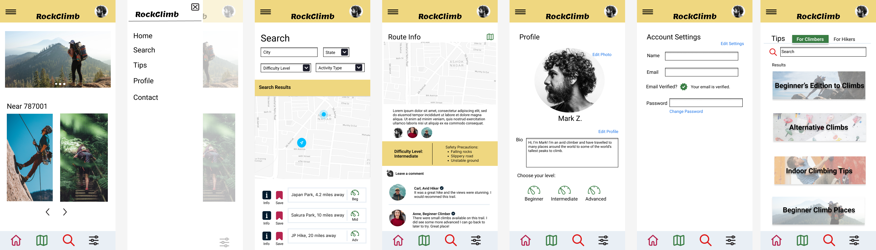
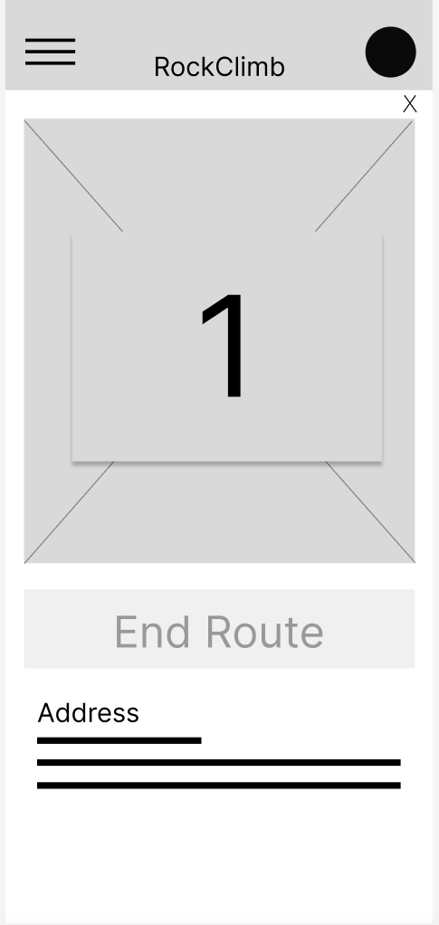
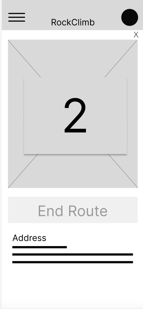
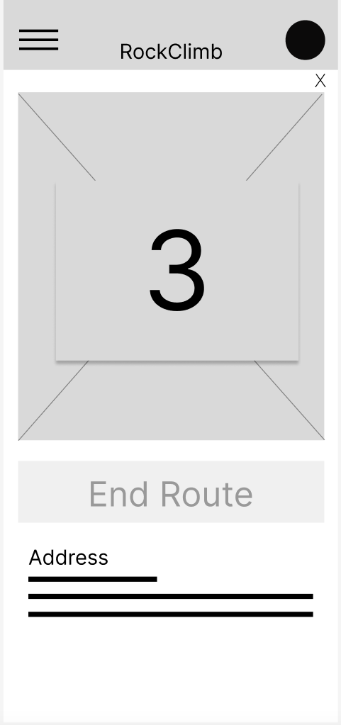
The connected prototype tested the full experience—from the home screen and navigation menu through tips, search, route details, mapping, destination feedback, comments, contact information, and profile. Individual route states let me test whether people understood when navigation was preparing, active, and complete.
03 · Usability study
The study asked participants to find a nearby climb, review other climbers’ experiences, and route to the location. Four themes shaped the next iteration.
Participants preferred completing the route flow without leaving the app.
A visible countdown could remove uncertainty after selecting Route.
Users wanted to look beyond suggested locations and discover other climbs.
The comments area needed clearer hierarchy and less visual competition.
04 · Refining the design
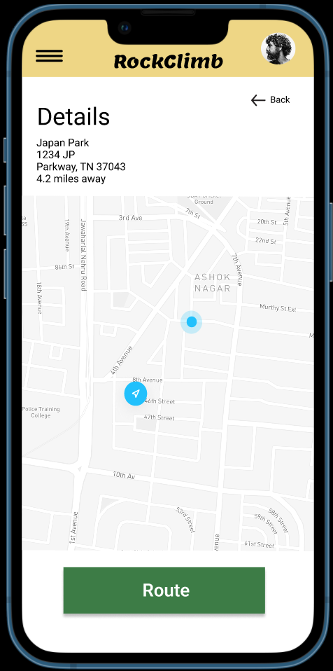
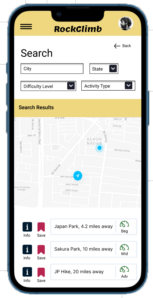
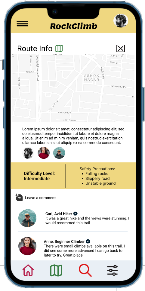
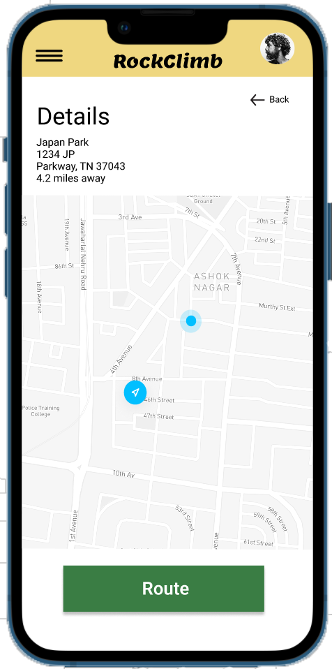
The revised flow gave routing a clear start and end state, strengthened route information, and kept community advice close to the map rather than separating it into another journey.
High-fidelity prototype
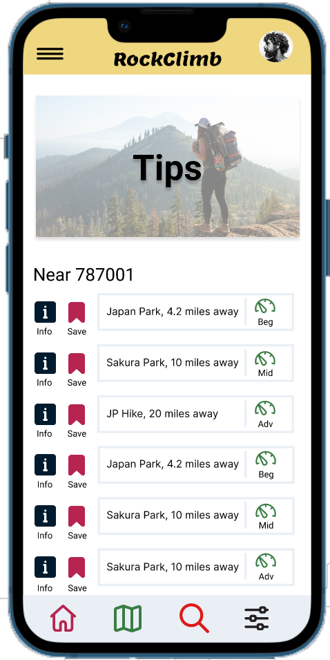
The final concept combines nearby route discovery, filters, detailed safety information, peer advice, and in-app navigation.
05 · Looking back
Validate the offline model. Define what data is downloaded, how freshness is communicated, and what happens when a route changes.
Test accessibility earlier. Include keyboard and screen-reader behavior, touch-target sizing, contrast, motion preferences, and nonvisual map alternatives from the first prototype.
Reduce visual noise. Give safety status, route difficulty, and the primary action stronger hierarchy than secondary community content.
Research in context. Observe climbers preparing at home and navigating at a real site, where light, weather, gloves, stress, and poor connectivity affect use.
What carried forward
RockClimb was an early foundation for the work I do now: understanding the user’s mental model, making the core action testable, observing where expectations break, and using feedback to make the next move clearer.
Return to selected work